ux case study
Simplifying Clinical Workflows
Interactive Questionnaire MVP for Vancouver-Based Startup
Role:
Designer
Type:
Capstone Project
Timeline :
6 months (2022-23)
Project Summary
Designing interactive questionnaires to help streamline physician workflow and improve communication between doctors and patients
Key Takeaways
- Physicians lose 35% time documenting patient data
- Interactive questionnaires can speed up paperwork and allow more patient time
- Questionnaire responses can be populated in consult notes to consolidate information
Preliminary Research
The Opportunity Space

Physicians spend 35% of their total time (at the clinic) documenting patient data which is about 8 mins per patient
“If you’re only spending eight minutes talking to and examining a patient, something is certainly going to be missing.”
~ Leonard S. Feldman

The Challenge
Simplify documentation workflow to reduce administrative burden.
The 4 existing solutions
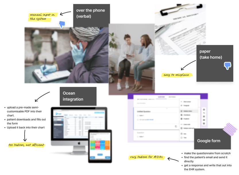
The 4 existing solutions were:
- Verbal back and forth over the phone
- Paper form to take home
- Integration with Ocean
- Google forms
None were efficient since they involved significant back-and-forth with the patient as well as were not a well integrated part of the system. Therefore, there was a significant opportunity for improvement.
The Goal:
To create an intuitive and EHR-integrated system for physicians to document patient information
Less Touchpoints
Having less steps to achieve the goal to make the process faster and smoother
Intuitiveness
Creating a system that requires little to no training for new personnel
Customisation
Designing an adaptable workflow for the information each physician needs
User Research
Physicians crave a better workflow
I inquired about the primary goals and objectives that users hope to achieve, their biggest pain points and frustrations as well as specific needs, requirements and expectations from the new system.
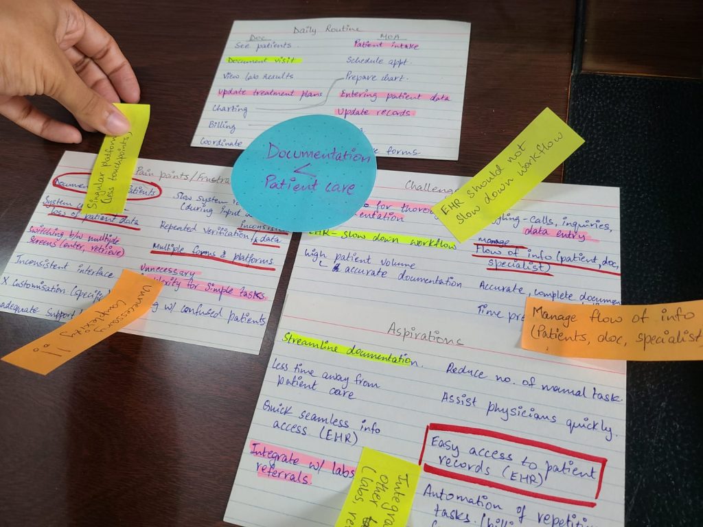
The average physician / MOA experiences chaos, under confidence, and frustration. By gaining insights into these issues, I identified opportunities to improve their workflows and ultimately enhance patient outcomes. I developed an understanding of their daily routines, challenges, and aspirations.
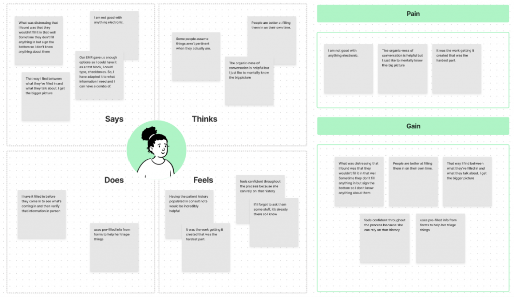
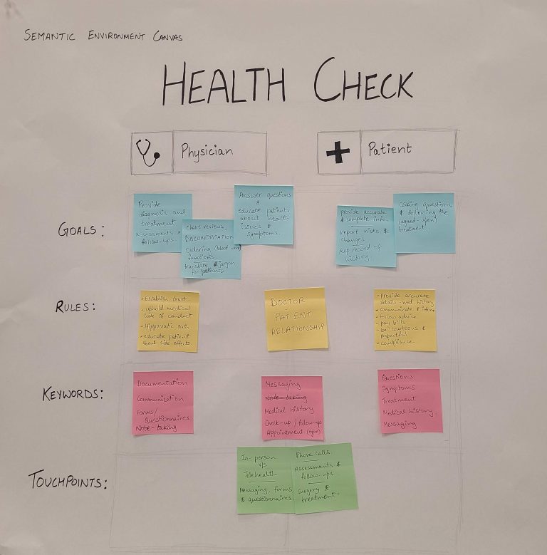
*Constraints*
There were significant limitations in terms of budget, time, and cultural factors. To overcome them, I prioritized research methods like contextual inquiries as well as utilized existing customer support records.
Early Insights
Initial research revealed several key challenges faced on the patient-level and healthcare provider-level within the clinic that influenced the workflow.

Patient-level challenges:
- Patients struggle to accurately recall their medical history.
- Patients expressed frustration with the time-consuming nature of filling out lengthy forms.

Provider-level challenges:
- Some staff members lack access to administrative systems which might cause inefficiencies and data inconsistencies.
- Different physicians need different specific information.
Ideation
Brainstorming Potential Solutions

2 pivotal user interviews
I conducted interviews with 4 physicians and the medical operations assistant at a local naturopathic clinic. These interviews provided valuable insights into the unique challenges and opportunities faced by practitioners involving workflow efficiency, patient interactions as well as technological challenges.
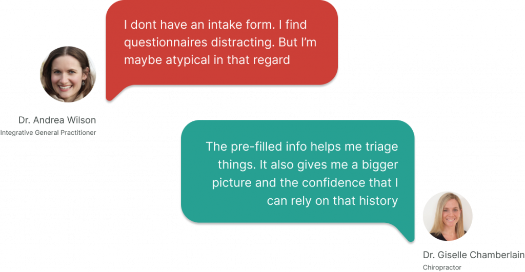
Dr. Wilson viewed questionnaires as a distraction while forms were a source of confidence for Dr. Chamberlain. The interview helped me realize that the proposed idea would not be used by all physicians. This allowed for a defined value proposition for a refined persona.
Persona Development
Physicians vary in their workflows and patient interactions, and their specific information needs differ by specialty. Interviews revealed that not all physicians would benefit from a new feature. However, I identified a key target: physicians who prioritize pre-visit preparation and minimize in-visit documentation.
To inform future decisions, I developed refined personas for both physicians and their patients. These personas will guide product development and ensure that the solution aligns with the needs of its intended users.
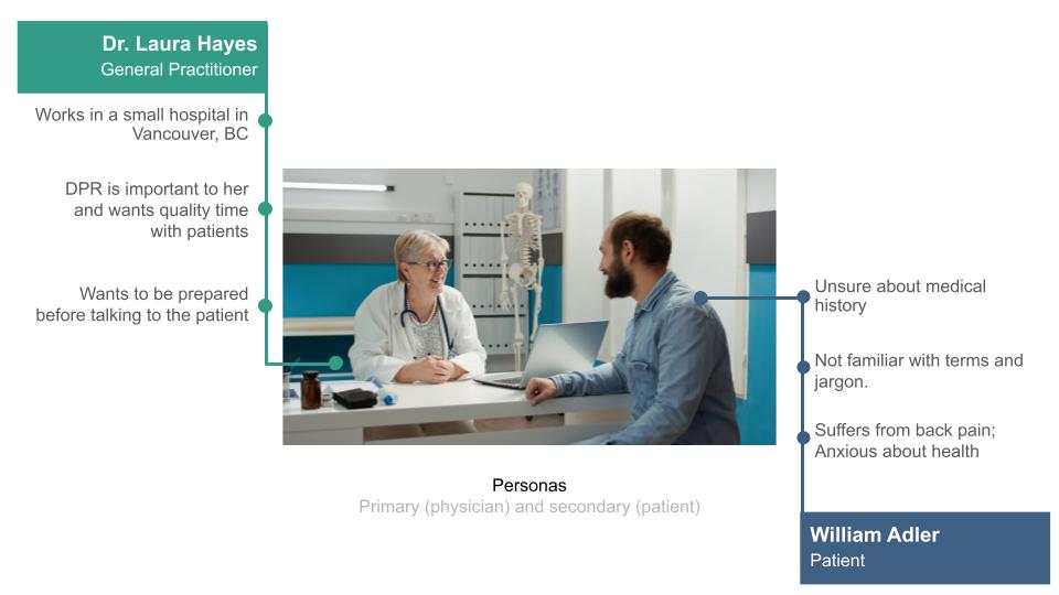
Refined physician (primary) and patient (secondary) personas
The New Physician-patient interaction system

Rapid Prototyping
Prototyping The Questionnaire Engine
Creating Questionnaire (Provider workflow)
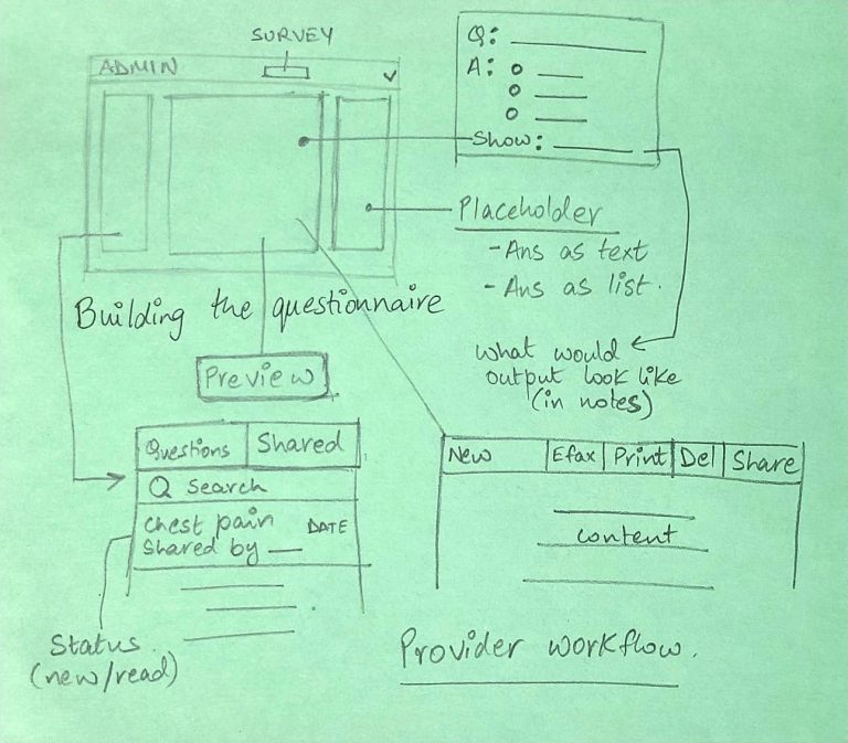
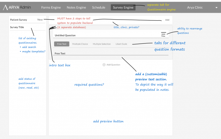
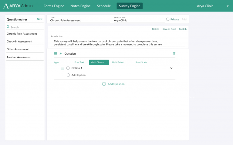
Usability Testing Feedback
Usability testing feedback revealed several areas for improvement:
- Color Scheme: The use of green throughout the interface was perceived as excessive and confusing. Green is typically associated with action items or positive feedback. Consider using a more neutral color palette for informational elements.
- Required Toggle: The required toggle for certain fields was not intuitive, leading to user confusion and frustration. Ensure that required fields are clearly indicated through visual cues or contextual hints.
- Question Type Label: The “type” category label for question types was deemed unnecessary and redundant. Consider removing to simplify the interface and reduce cognitive load on users.
Resolution
Final Deployment
Resolution
Project Impact
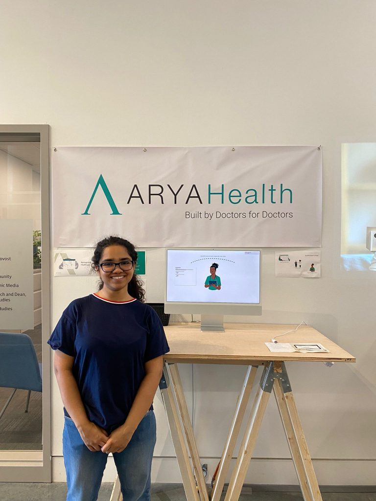
Arya’s Questionnaire Engine was implemented in the EHR to streamline and improve the patient data collection process. The project successfully achieved its objectives, as evidenced by the following metrics:
- 62% User Satisfaction – physicians reported that it has improved their workflow with this feature.
- 78% Time Saved – physicians reduced time while collecting data
- 64% Admin Time Saved – Administrative tasks associated with patient intake have been reduced
